Designing clarity for complex data
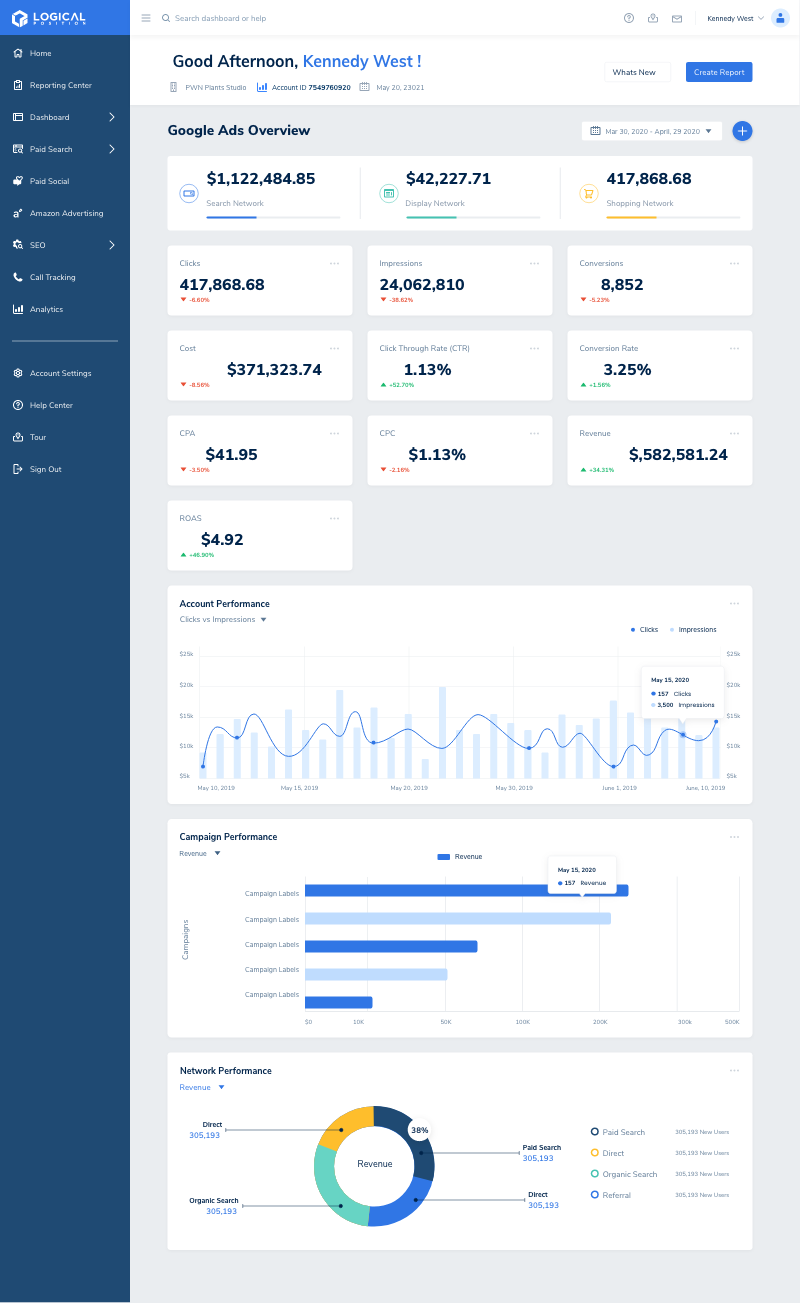
Led the UX strategy, research, and design for Logical Position’s unified client dashboard—transforming complex analytics into clarity for over 600 clients.
Tools: Figma · Mural · Quickbase · Looker Studio · Adobe XD · Illustrator
Impact: ↑ 40 % visualization clarity · ↓ support tickets · ↑ client engagement and retention


Logical Position is a national digital marketing agency specializing in SEO, Paid Search, Paid Social, and Data Analytics. Their internal marketing teams managed campaigns for over 600 clients, yet each account relied on different reports, PDFs, and data sources making it difficult to see performance in one place.

Before the redesign, data lived across multiple systems: Quickbase, Google Ads, CallRail, and manual spreadsheets.
Account Managers struggled to find insights quickly and clients lacked a single source of truth for campaign results, billing, and communication.
Key challenges:
To ensure the dashboard addressed real client pain points, I defined measurable goals and constraints:
Objectives:
Constraints:
%20copy.jpg)
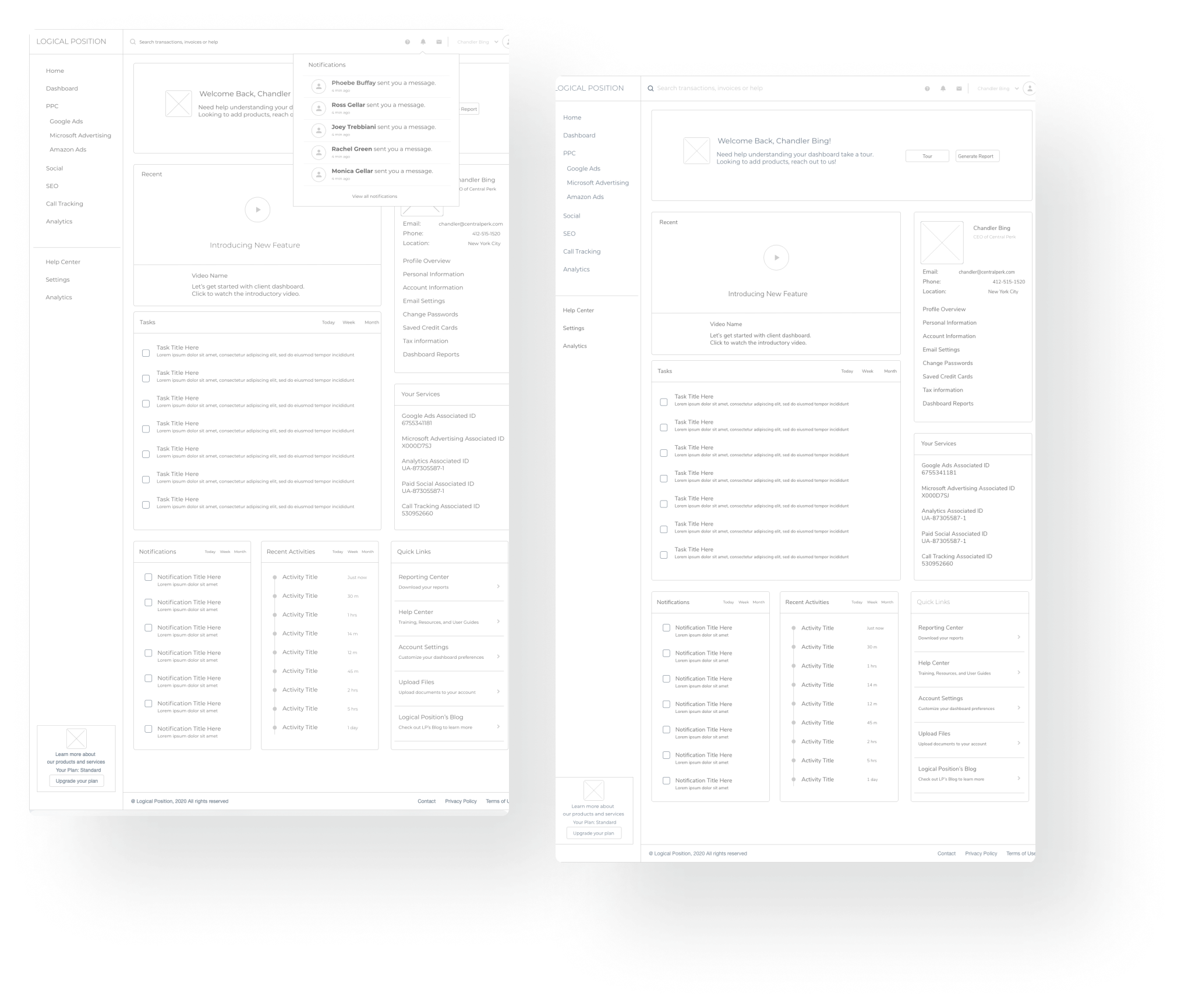
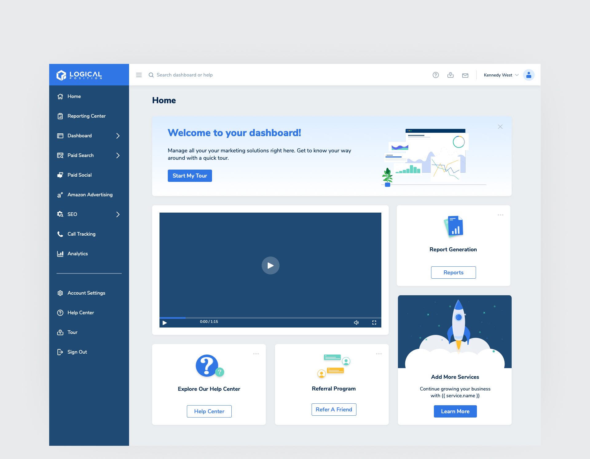
Create a centralized dashboard and client portal that enables users to access key marketing insights, track billing, and communicate seamlessly all in one place.
As the sole UX Designer partnered with one front-end engineer and a visual designer (Gabby), I led the full UX process from discovery through delivery.
This project spanned from early discovery through multi-year iterative releases, laying the foundation for the future Client Portal ecosystem.
The redesign followed an iterative process that turned raw analytics into actionable insight. My process balanced research, iteration, and data visualization to deliver clarity at scale.
nterviewed Account Managers and analyzed how they prepared client reports. Mapped pain points and workflow friction in Mural to identify opportunities for automation and clarity.
Through interviews and data reviews, I identified recurring themes:
“Clients need one place where they can see everything, understand it, and take action.”
That became the north star for the entire design system.
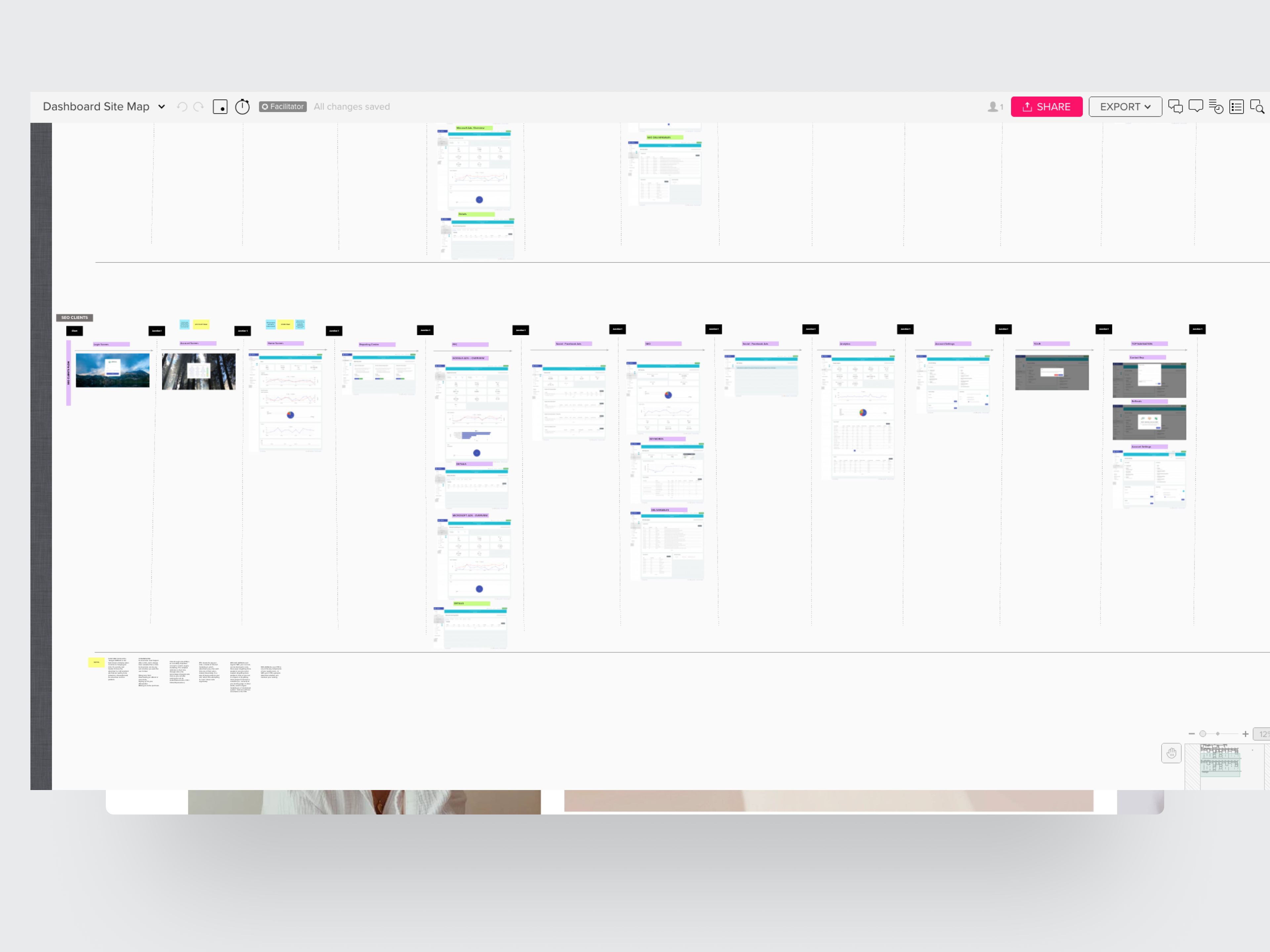
Created low-fidelity wireframes and explored visualization layouts that surfaced the most valuable metrics first.Standardized charts, typography, and data components to ensure visual consistency and scalability.
Core Design Decisions:
Prototyped in Figma and tested flows internally. Collaborated with engineering to integrate Looker Studio and Quickbase data pipelines.Launched the MVP version with built-in feedback loops to measure engagement and comprehension.
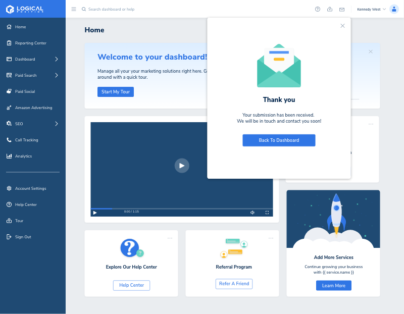
The redesigned dashboard became the central source of truth for 600+ client accounts, improving engagement, transparency, and decision-making.

Designing this end-to-end experience taught me how to translate complex data systems into intuitive, human-centered interfaces.
This project wasn’t just about dashboards it was about designing trust. Turning complex, disconnected systems into an experience clients could depend on every day.


Explore selected case studies and design highlights.
![[interface] image of a group discussing in an office (for a legal tech)](https://cdn.prod.website-files.com/68ddc5df245d0f29ee6bbe9a/68e3038ba8f710b7f0cd7867_new_reporting_center.png)

![image of industry analysis [interface]](https://cdn.prod.website-files.com/68ddc5df245d0f29ee6bbe9a/68e30389e7077842f6a056ef_dashboard-graphic-1-1.png)
![[digital project] image of a mobile device with a social media ad (for a graphic design studio)](https://cdn.prod.website-files.com/68ddc5df245d0f29ee6bbe9a/68e3038bbb5ae9bb24645784_new_login1.png)
![[digital project]](https://cdn.prod.website-files.com/68ddc5df245d0f29ee6bbe9a/68e3038ba8f710b7f0cd7867_new_reporting_center.png)


![[digital project] image of interface explaining ai curriculum](https://cdn.prod.website-files.com/68ddc5df245d0f29ee6bbe9a/68e3038e8a57a7b5bde9f7f8_Paid%20Search%20e-commerce%20Google%20Ads%20%E2%80%94%20Learn%20More%20Infographic.png)
![[interface] screenshot of collaboration interface (for a productivity tools business)](https://cdn.prod.website-files.com/68ddc5df245d0f29ee6bbe9a/68e2fed1b534a5ce6175d24f_Portfolio%20mockup%402x%20copy.png)


A curated selection of Dashboard projects
Have questions or want to discuss design? Reach out or browse more insights below.