developed a company-wide Data Visualization Style Guide to establish consistency, clarity, and visual hierarchy across all dashboards, reports, and analytics tools.
Role: Senior UX Designer
Project Type: Internal Design System / Data Visualization Standards
Timeline: 4 Weeks
Tools: Figma, Adobe Illustrator, Confluence, SharePoint

As part of Logical Position’s ongoing digital transformation and design system initiative, I developed a company-wide Data Visualization Style Guide to establish consistency, clarity, and visual hierarchy across all dashboards, reports, and analytics tools.Before this project, different departments were creating their own reporting layouts—resulting in inconsistent color usage, misaligned legends, unclear typography, and accessibility issues. The lack of standardization made it difficult for clients and internal teams to interpret key metrics at a glance.My goal was to create a unified visual language for data presentation that aligned with LP’s brand system while improving usability and comprehension across internal and client-facing platforms.
Logical Position’s analytics ecosystem spans multiple tools
(Looker Studio, Quickbase, Google Ads dashboards, and Excel-based reports).
Develop a Data Visualization Style Guide that would
I began by auditing dashboards across departments including Paid Search, SEO, and Account Performance. I cataloged the most frequently used visualization types and identified pain points through internal interviews with Account Managers and data analysts.
Stakeholders struggled to interpret metrics when color meanings varied across reports.Some charts used gradients or overly complex palettes that reduced legibility.Label truncation and inconsistent font sizing made comparison difficult.From these insights, I mapped out a prioritized list of improvements and began defining design principles for data visuals: Clarity, Consistency, and Contrast.
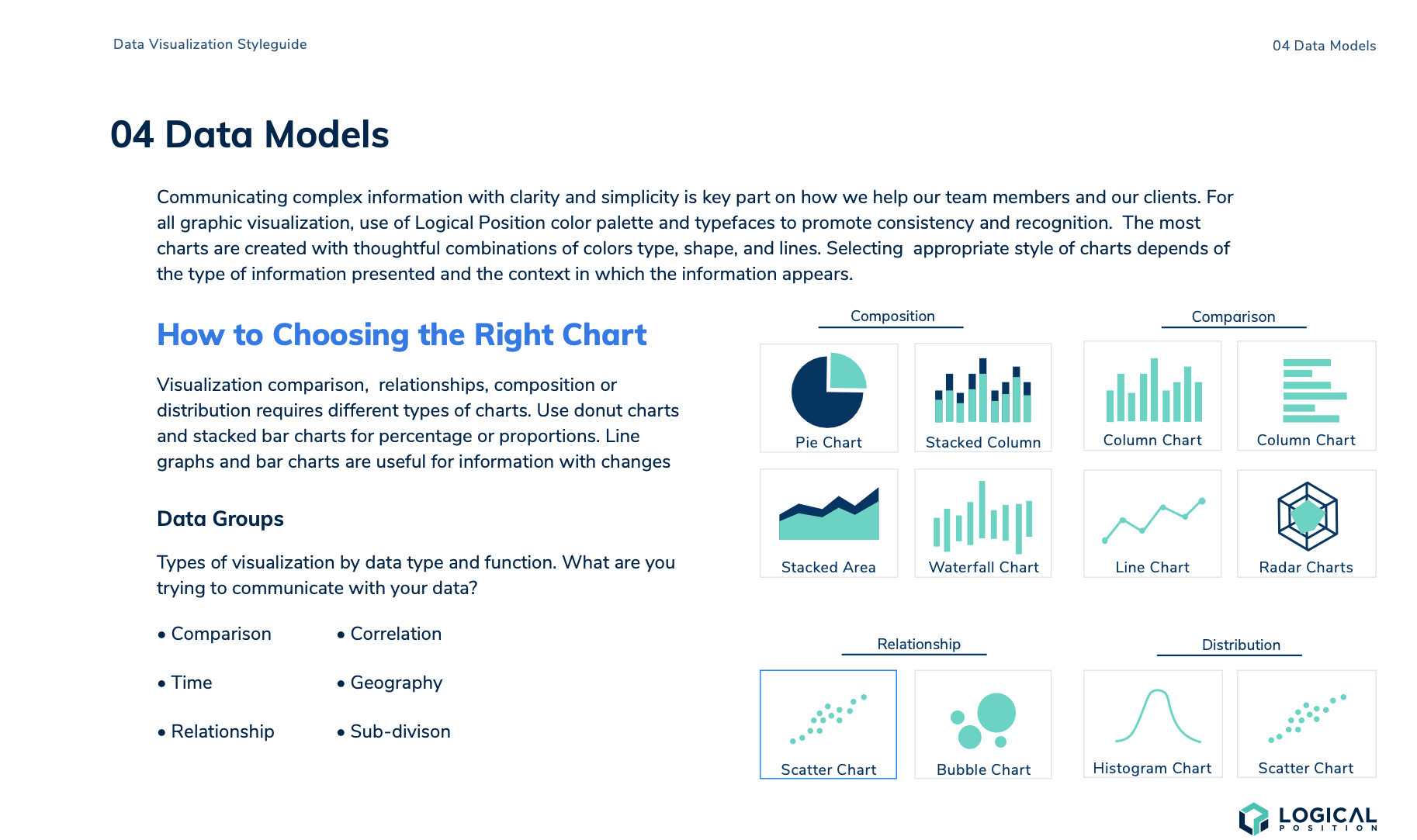
Collected screenshots and samples from various reporting tools. Grouped them by visualization type (e.g., line charts, bar charts, pie charts, KPI tiles).
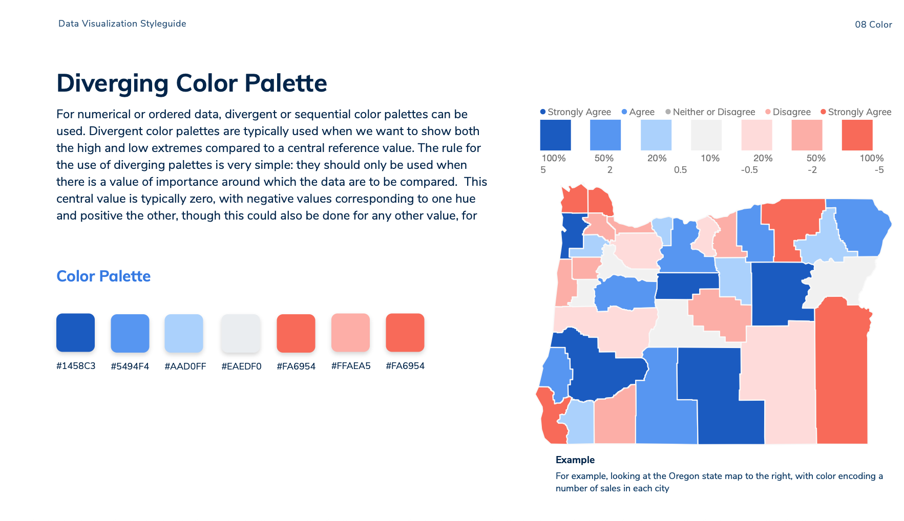
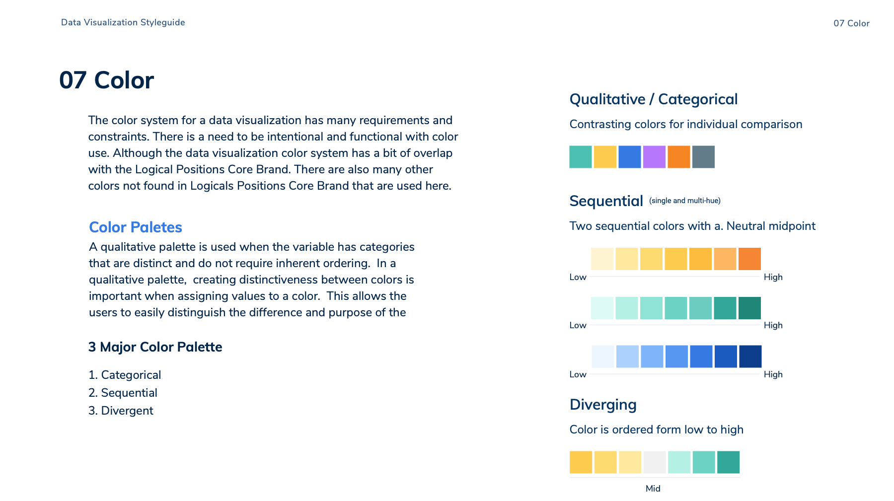
Created color mapping rules for different metric categories (Performance, Spend, Conversions, Engagement).Primary Palette: Brand blues and greens for positive metrics.Secondary Palette: Neutral greys for context and supporting visuals.Alert Palette: Red/orange hues reserved strictly for negative performance or system issues.
Established consistent use of typography for chart titles, legends, and axis labels using the LP type scale from the Design System.Titles: 16–18ptLabels: 12–14ptLegends: 11–12pt (semi-bold)
Validated all colors for WCAG AA compliance and tested chart legibility in both light and dark backgrounds using simulators for color blindness.
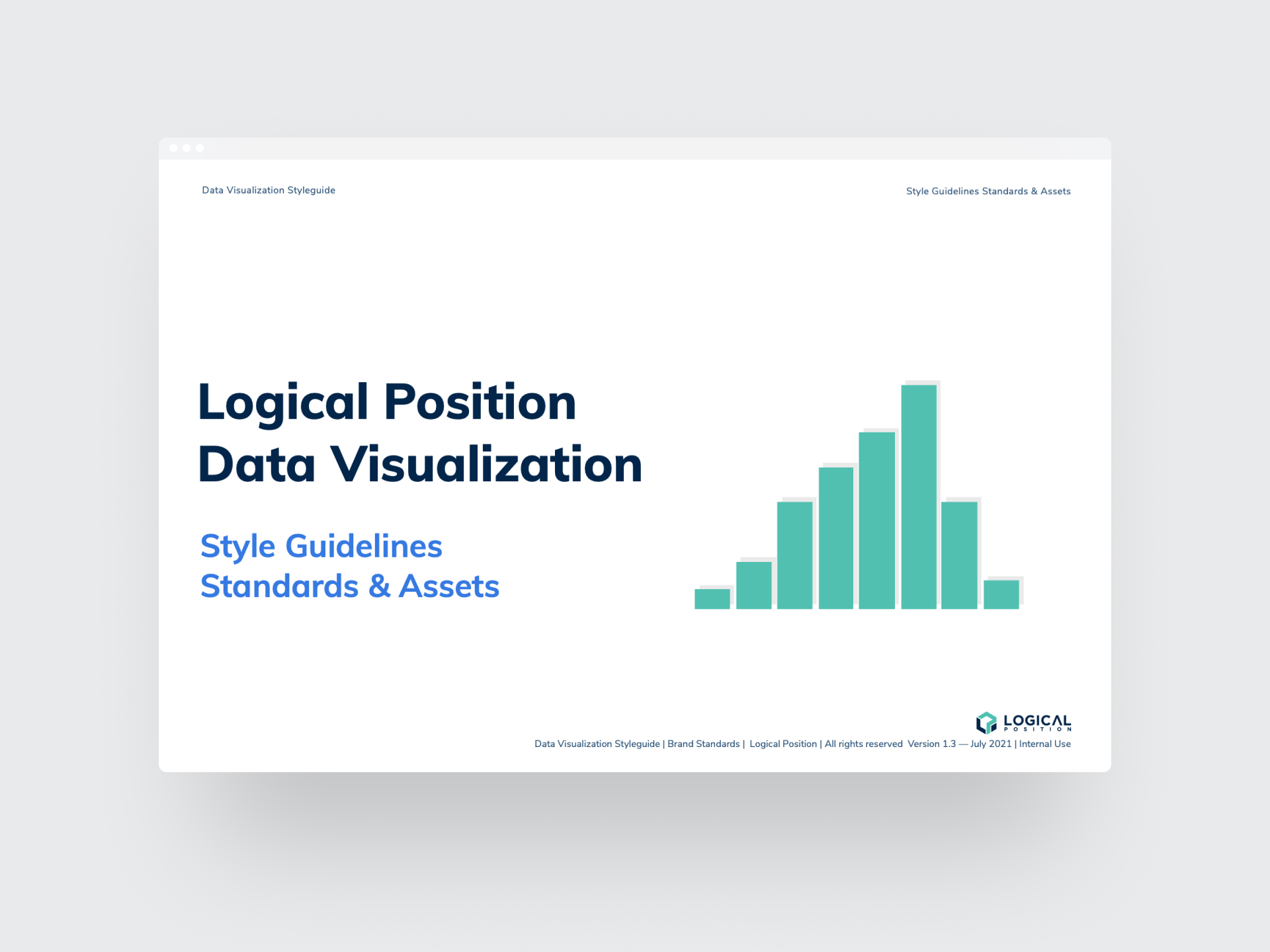
Compiled final visual specifications into a comprehensive Data Visualization Style Guide Deck, which was then uploaded to Confluence and SharePoint for company-wide access.Each slide included clear do’s and don’ts, color hex codes, chart spacing rules, and component naming conventions for designers and analysts to follow.
The Data Visualization Style Guide became part of the Logical Position Design System and was adopted across multiple departments.Impact:Improved visual consistency across client-facing reports and internal dashboards.Reduced handoff time between design and analytics teams.Enhanced data readability and reduced misinterpretation in weekly reporting.Served as a training reference for new designers and analysts.By standardizing color usage and visualization hierarchy, the guide established a shared visual logic—allowing teams to focus on insights rather than decoding design differences.
Data Visualization Style Guide Deck (final artifact shown at the end of the case study)Color and typography reference sheetAccessibility and legibility testing summaryImplementation checklist for analysts and designers
As part of Logical Position’s ongoing digital transformation and design system initiative, I developed a company-wide Data Visualization Style Guide to establish consistency, clarity, and visual hierarchy across all dashboards, reports, and analytics tools.Before this project, different departments were creating their own reporting layouts—resulting in inconsistent color usage, misaligned legends, unclear typography, and accessibility issues. The lack of standardization made it difficult for clients and internal teams to interpret key metrics at a glance.My goal was to create a unified visual language for data presentation that aligned with LP’s brand system while improving usability and comprehension across internal and client-facing platforms.
Logical Position’s analytics ecosystem spans multiple tools (Looker Studio, Quickbase, Google Ads dashboards, and Excel-based reports).
Each department visualized performance data differently—resulting in:
Rebuild the UI and layout to improve clarity and discoverability
Develop a Data Visualization Style Guide that would:
I began by auditing dashboards across departments including Paid Search, SEO, and Account Performance. I cataloged the most frequently used visualization types and identified pain points through internal interviews with Account Managers and data analysts.
Stakeholders struggled to interpret metrics when color meanings varied across reports.Some charts used gradients or overly complex palettes that reduced legibility.Label truncation and inconsistent font sizing made comparison difficult. From these insights, I mapped out a prioritized list of improvements and began defining design principles for data visuals: Clarity, Consistency, and Contrast.
Collected screenshots and samples from various reporting tools. Grouped them by visualization type (e.g., line charts, bar charts, pie charts, KPI tiles).
Created color mapping rules for different metric categories (Performance, Spend, Conversions, Engagement).Primary Palette: Brand blues and greens for positive metrics.Secondary Palette: Neutral greys for context and supporting visuals.Alert Palette: Red/orange hues reserved strictly for negative performance or system issues.
Established consistent use of typography for chart titles, legends, and axis labels using the LP type scale from the Design System.Titles: 16–18ptLabels: 12–14ptLegends: 11–12pt (semi-bold)
Validated all colors for WCAG AA compliance and tested chart legibility in both light and dark backgrounds using simulators for color blindness.
Compiled final visual specifications into a comprehensive Data Visualization Style Guide Deck, which was then uploaded to Confluence and SharePoint for company-wide access.Each slide included clear do’s and don’ts, color hex codes, chart spacing rules, and component naming conventions for designers and analysts to follow.
The Data Visualization Style Guide became part of the Logical Position Design System and was adopted across multiple departments.Impact:Improved visual consistency across client-facing reports and internal dashboards.Reduced handoff time between design and analytics teams.Enhanced data readability and reduced misinterpretation in weekly reporting.Served as a training reference for new designers and analysts.By standardizing color usage and visualization hierarchy, the guide established a shared visual logic—allowing teams to focus on insights rather than decoding design differences.
Data Visualization Style Guide Deck (final artifact shown at the end of the case study)Color and typography reference sheetAccessibility and legibility testing summaryImplementation checklist for analysts and designers
This project reinforced how crucial visual systems are in making complex information digestible. Standardizing data visualization not only improved user comprehension but also aligned the organization’s design maturity.Creating the guide was a cross-functional effort that bridged design, data, and development—demonstrating how design thinking can scale beyond interfaces to influence culture and communication.
This project reinforced how crucial visual systems are in making complex information digestible. Standardizing data visualization not only improved user comprehension but also aligned the organization’s design maturity.Creating the guide was a cross-functional effort that bridged design, data, and development—demonstrating how design thinking can scale beyond interfaces to influence culture and communication.



![image of industry analysis [interface]](https://cdn.prod.website-files.com/68ddc5df245d0f29ee6bbe9a/68ed8cb337310f66fb5f0904_Screenshot%202025-10-13%20at%204.34.14%E2%80%AFPM.png)
![[digital project] image of a mobile device with a social media ad (for a graphic design studio)](https://cdn.prod.website-files.com/68ddc5df245d0f29ee6bbe9a/68ed8cb3e09f1e3e0e87f3d8_Screenshot%202025-10-13%20at%204.34.24%E2%80%AFPM.png)
![[digital project]](https://cdn.prod.website-files.com/68ddc5df245d0f29ee6bbe9a/68ed8db644ff3bb50a18944d_Screenshot%202025-10-13%20at%204.37.31%E2%80%AFPM.png)


![[digital project] image of interface explaining ai curriculum](https://cdn.prod.website-files.com/68ddc5df245d0f29ee6bbe9a/68ed8cb3ca862b6dc4337342_Screenshot%202025-10-13%20at%204.33.09%E2%80%AFPM.png)
![[interface] screenshot of collaboration interface (for a productivity tools business)](https://cdn.prod.website-files.com/68ddc5df245d0f29ee6bbe9a/68ed8cb28adc86bef3247b51_Screenshot%202025-10-13%20at%204.34.05%E2%80%AFPM.png)


A curated selection of Website Redesign projects
Have questions or want to discuss design? Reach out or browse more insights below.