stablishing a unified design system to improve consistency, scalability, and cross-team collaboration across all Logical Position products.
Over two years, I led the creation of Logical Position’s internal Design System — defining color, type, spacing, and component foundations across multiple internal and client-facing products. What started as a small set of shared Figma components evolved into a company-wide system that streamlined design handoffs, reduced rework, and established visual cohesion across marketing and product interfaces.
Details
Role: Senior UX Designer & System Lead
Timeline: Six months
Team: Me (UX Lead), Gabby (Brand Design), Front-End EngineersTools Adobe XD, Figma, Illustrator, Storybook, Confluence, SharePoint, ZeroHeight (or equivalent), a11y contrast tools

As Senior UX Designer, I partnered with stakeholders across product, development, and creative teams to align design standards and ensure a scalable foundation for growth.
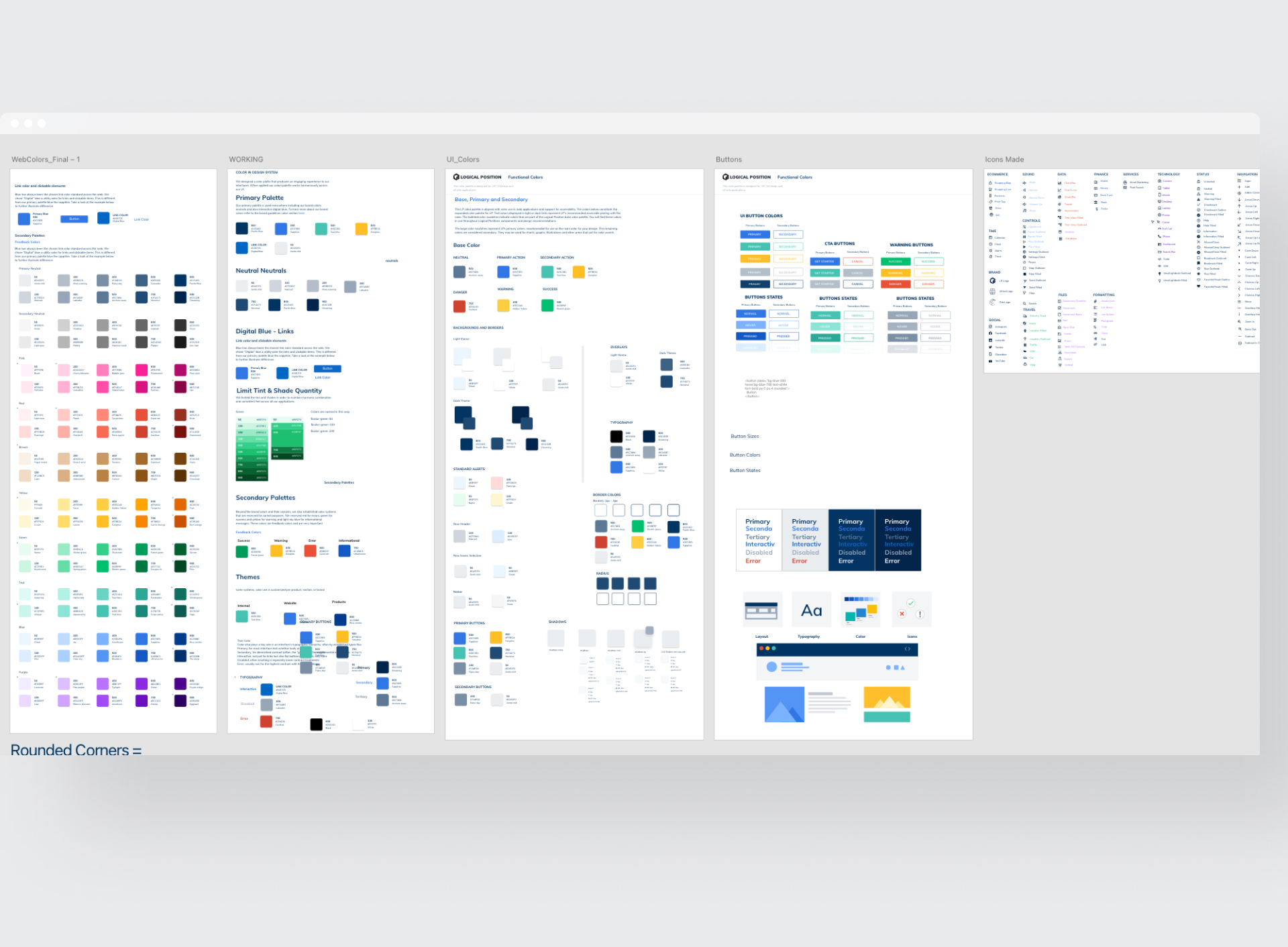
Multiple product teams were creating inconsistent interfaces without a unified system, resulting in slower delivery and higher design debt.
Without shared documentation, even small UI changes required rework across tools
increasing QA overhead and fragmenting the user experience.
Our goal: create a single source of truth that would unify design standards and accelerate delivery across the organization.
Led UX strategy and system architecture for Logical Position’s cross-product design system.
I served as Design System Lead, responsible for:
The approach centered around research, systemization, and collaboration. I broke the process into structured phases audit, define, build, and document ensuring every design decision was reusable, scalable, and measurable.
We aligned around three principles:

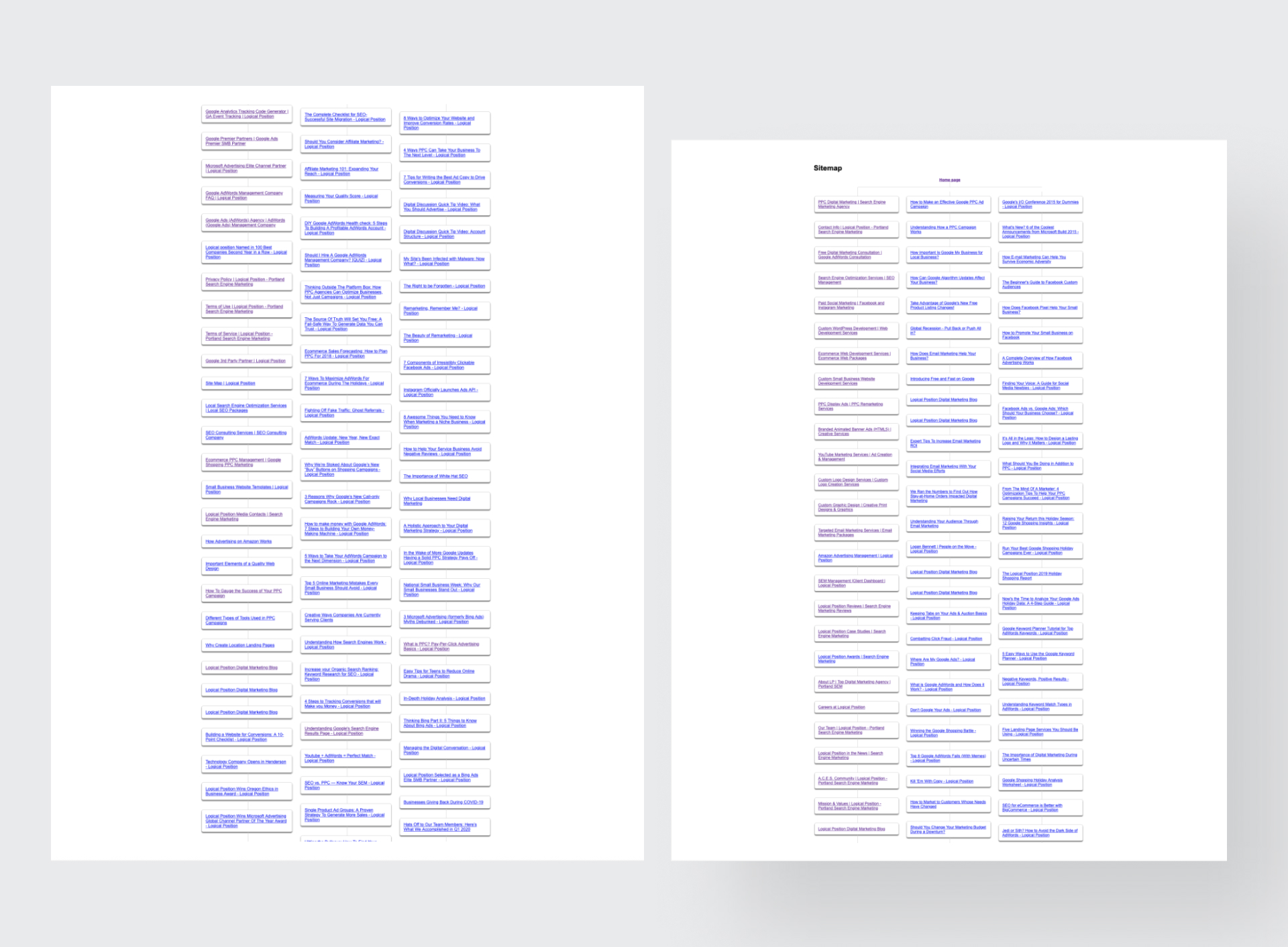
I began by conducting a full component and color audit across Figma files and Quickbase environments.Through interviews with designers and engineers, I identified recurring inconsistencies, redundant patterns, and inefficiencies in naming conventions.
Key findings:

I created a token framework to standardize color, type, spacing, and component states.Tokens were structured for both Figma and engineering parity — synced directly into Storybook to ensure front-end alignment.
Example:
color.primary.100, color.primary.200 → semantic mapping font.scale.xs, font.scale.sm, font.scale.md → scalable typography hierarchyspacing.4, spacing.8, spacing.16 → universal spacingThese foundations enabled rapid updates and ensured brand consistency across multiple applications. This reduced UI inconsistency by over 40% and provided the development team with a single reference for spacing, typography, and color usage.
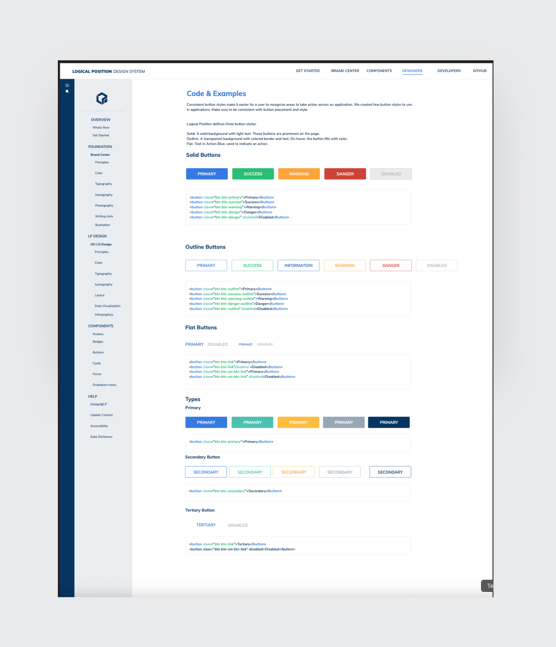
After solidifying tokens, I built a modular component library in Figma aligned with development naming conventions. Each component was documented for usage, variants, and states.
This allowed the product and marketing teams to design faster, with fewer revisions and clearer developer handoffs.
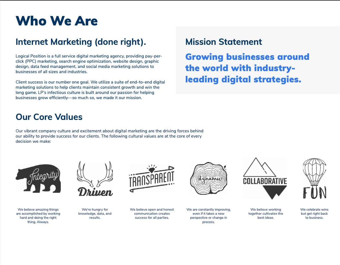
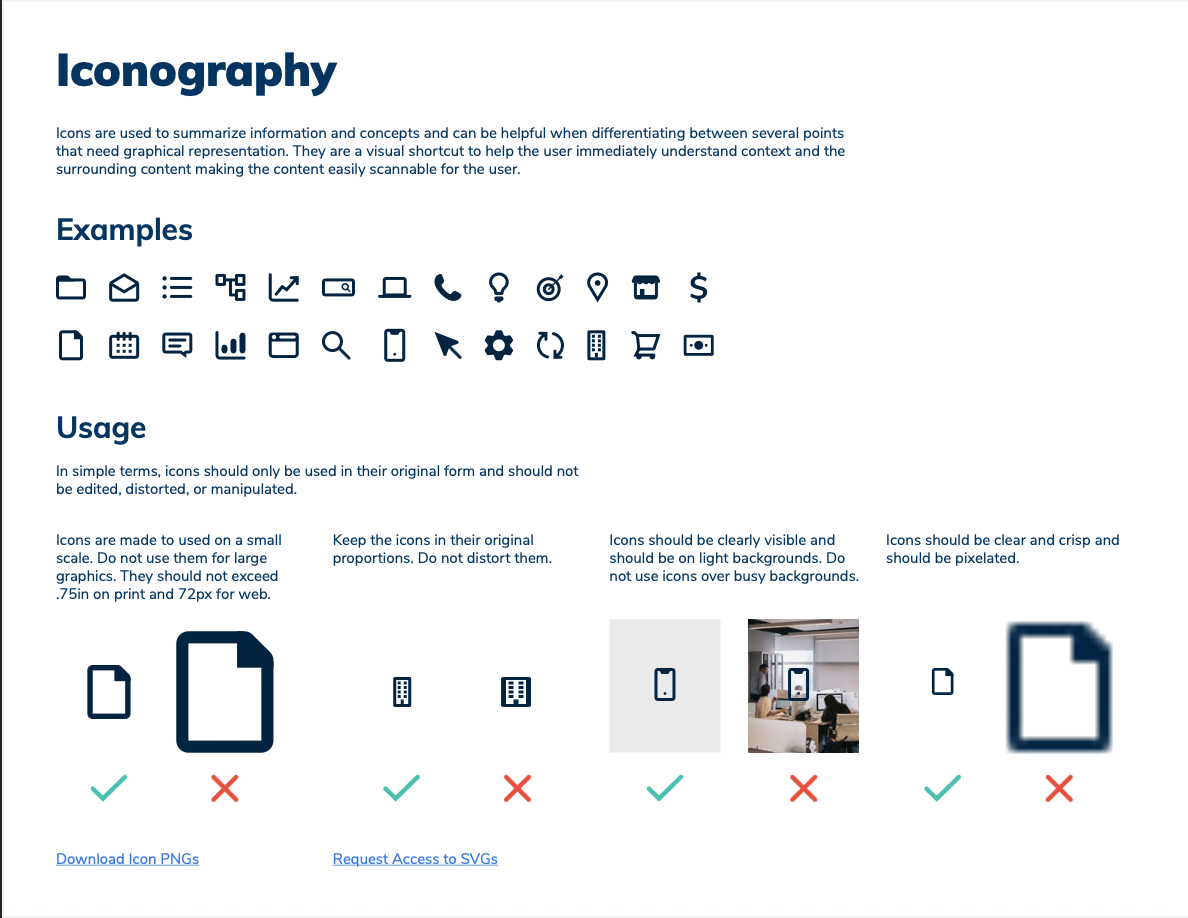
Documentation was built in Confluence and mirrored in Figma to serve as a living source of truth. I created visual examples, do/don’t patterns, and quick-reference sheets to support onboarding and governance.
The system now enables cross-team collaboration and ensures all new features follow consistent, accessible, and brand-aligned standards.
We aligned around three principles:
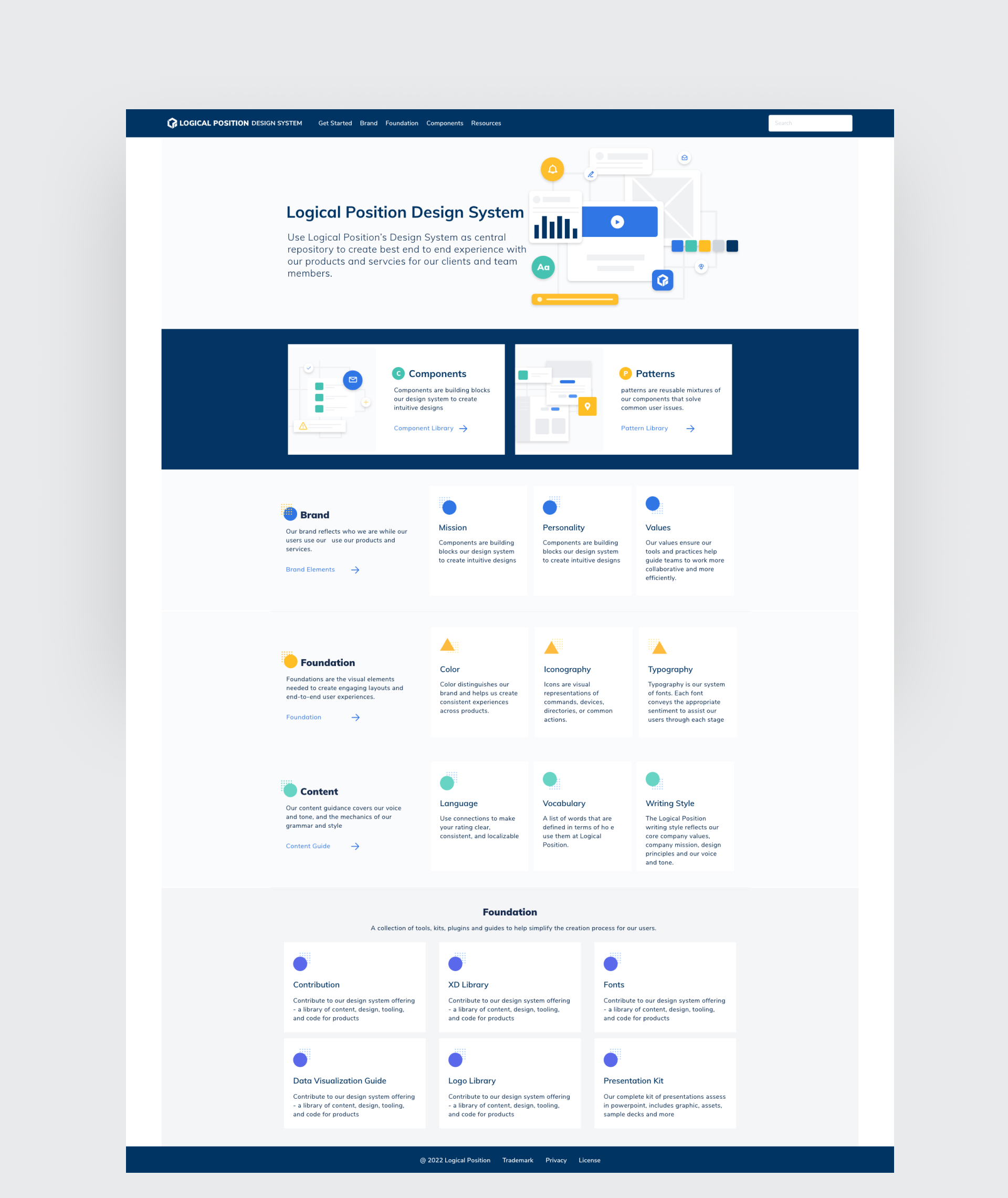
In collaboration with engineering, we integrated the Figma library with Storybook.
This ensured UI parity across design and code, eliminated redundant QA cycles, and allowed developers to pull components directly into production. We built design-to-dev sync pipelines through Bitbucket, ensuring every release remained visually consistent and accessible.
This project taught me the importance of designing for designers — creating tools that empower creativity rather than constrain it.
The Logical Position Design System continues to evolve, supporting every new initiative with clarity, efficiency, and cohesion.

This empowered cross-functional teams to expand the system responsibly maintaining cohesion while allowing evolution.To ensure adoption, I ran training sessions, created onboarding kits, and developed Slack integrations to notify teams of version updates.

We made adoption easy: a starter file for designers, a Figma/XD library with tokens, and a demo repo for engineers. I ran training sessions for marketing and onboarding so non-design teams could use brand-correct templates. We set up a searchable SharePoint area for downloads (logos, icon sets, slide templates), all linked back to the system as the canonical reference.


The design system reduced ambiguity and sped up delivery. Designers pulled components instead of re-drawing them. Engineering consumed documented props and tokens instead of hunting for pixel values. Marketing collateral finally matched product UI. We saw fewer handoff questions, fewer visual bugs, and faster first-pass builds.
Impact:

Building this design system taught me how to scale design thinking beyond screens into culture, process, and language. The system continues to evolve today, guiding every new product initiative at Logical Position.
![image of industry analysis [interface]](https://cdn.prod.website-files.com/68ddc5df245d0f29ee6bbe9a/68ed85f6bddd189de14226ce_Screenshot%202025-10-13%20at%204.06.07%E2%80%AFPM.png)

![[digital project]](https://cdn.prod.website-files.com/68ddc5df245d0f29ee6bbe9a/68ed80c426b6bee2c4d89dbd_Design-System4.jpg)




A curated selection of Website Redesign projects
Have questions or want to discuss design? Reach out or browse more insights below.