Clarifying the message, modernizing the experience, and rebuilding for the future. Transforming a high-traffic marketing site into a modern, conversion-driven experience.
Role: Senior UX Designer
Team: Uma Petersen (UX Design Lead) · Junior Visual Designer · Front-End Developer
Tools: Figma · Adobe XD · Illustrator · Mural
Duration: 6 Weeks

ed the UX strategy and information architecture for Logical Position’s website redesign — partnering with a visual designer and engineering to align brand, usability, and conversion goals.
This 6-week project modernized LP’s digital presence, simplified navigation, and improved content discoverability across 200+ pages.
Impact Highlights
.jpg)
Logical Position is a full-service digital marketing agency specializing in SEO, Paid Search, Paid Social, and Data Analytics.
Before the redesign, the company’s marketing site had grown fragmented content was difficult to find, navigation was inconsistent, and design standards varied widely across pages.

To deliver a cohesive, scalable website experience, I focused on four key objectives:

To deliver a cohesive, scalable website experience, I focused on four key objectives:
As the Senior UX Designer, I was responsible for:
This project showcased my ability to translate business goals into structured UX systems, guiding visual execution while ensuring strategic alignment.
My UX approach focused on creating a scalable framework grounded in research, collaboration, and clarity.I started by aligning business goals with user needs, then mapped every phase -discover, define, design, deliver, and measure to ensure decisions were informed by real data.This holistic process allowed me to translate complex requirements into a clean, intuitive structure that supported both marketing growth and long-term maintainability.
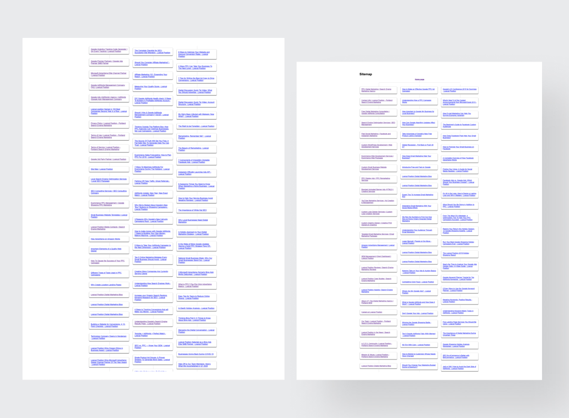
I began by auditing the existing site structure, reviewing analytics, and interviewing marketing stakeholders to define priorities.Through competitor benchmarking and sitemap mapping, we identified navigation redundancies and content gaps that were causing user drop-off.
Key insights:


Based on insights, I restructured the sitemap and created modular wireframes for homepage, industry, and service pages.
Each layout balanced storytelling and conversion, with clear CTAs and supporting visuals designed for scan-readability.
Design priorities

I collaborated with engineering and visual design to validate responsiveness and component flexibility in production.
Each template was tested internally for readability, accessibility, and SEO performance before rollout.
Deliverables
The redesign established a scalable framework for future growth — creating a website that not only looked modern but worked smarter.
Results

This project reminded me that design systems are only as strong as their foundations.
By defining structure, hierarchy, and reusability first, I helped transform an inconsistent site into a scalable platform that empowered the marketing team to grow efficiently.
Great design isn’t just what users see it’s how easily teams can build on it.
.jpg)
![image of industry analysis [interface]](https://cdn.prod.website-files.com/68ddc5df245d0f29ee6bbe9a/68ed9cc783851375fbfe591a_inforgraphics%20(1).jpg)
![[digital project] image of a mobile device with a social media ad (for a graphic design studio)](https://cdn.prod.website-files.com/68ddc5df245d0f29ee6bbe9a/68ed9cc479bbee1deebf208c_inforgraphics.jpg)
![[digital project]](https://cdn.prod.website-files.com/68ddc5df245d0f29ee6bbe9a/68e32f3d62070af547a46806_screencapture-logicalposition-about-2023-03-07-11_41_56.png)


![[digital project] image of interface explaining ai curriculum](https://cdn.prod.website-files.com/68ddc5df245d0f29ee6bbe9a/68e32f3c97f87bcbae313db5_screencapture-logicalposition-contact-2023-03-07-11_42_52.png)
![[interface] screenshot of collaboration interface (for a productivity tools business)](https://cdn.prod.website-files.com/68ddc5df245d0f29ee6bbe9a/68e1f60106d641fb7ce30f91_Group%2041543.png)


A curated selection of Website Redesign projects
Have questions or want to discuss design? Reach out or browse more insights below.